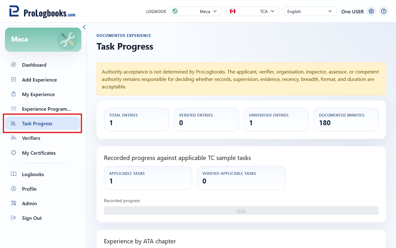
Summary totals
The top row of stat cards shows four totals for the active logbook: total entries logged, entries marked verified, entries not yet verified, and total documented minutes. These counts cover all entries regardless of the active logbook view.
TCA recorded progress (TCA view only)
This card is visible only when the active logbook view is set to TCA (Transport Canada). It counts entries whose applicability state is set to "applicable" and shows how many of those have been verified. The progress bar displays the verified percentage across all applicable entries.
An entry must be explicitly marked applicable in the authority section of the entry form to be counted here. Entries marked not applicable or with no applicability state recorded are excluded from the denominator.
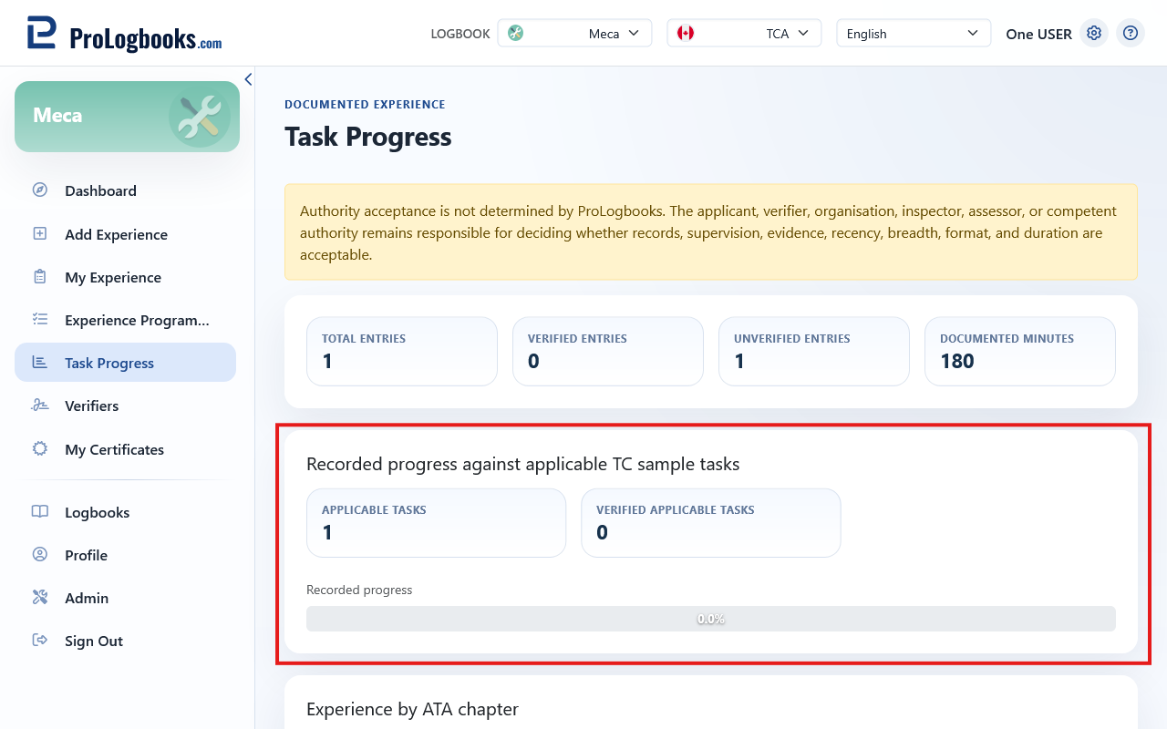
- The progress bar shows: verified applicable tasks ÷ total applicable tasks × 100.
- This percentage is a logbook record indicator only. Transport Canada determines licence eligibility independently.
FAA practical-experience hours (FAA view only)
This card is visible only when the active logbook view is set to FAA. It groups total logged minutes by rating scope (Airframe, Powerplant, or Both) as recorded in each entry's authority section. The estimated months figure divides the combined total by 160 hours, the approximate monthly threshold used as a working reference.
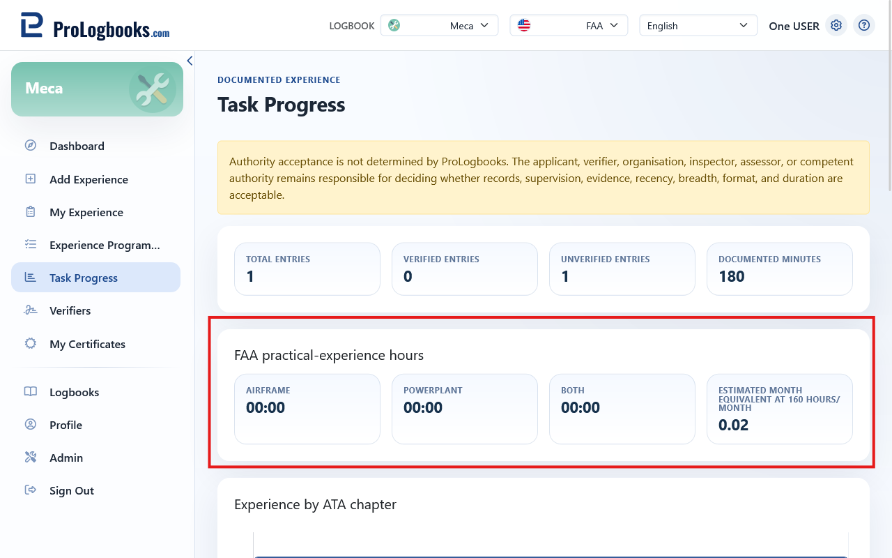
- Hours are shown in H:MM format.
- The month estimate is a convenience figure only. FAA eligibility criteria are determined by the examining authority.
Experience charts
Four charts give a visual breakdown of how your experience is distributed.
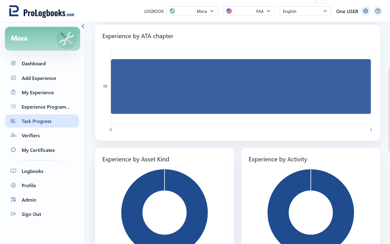
- ATA Chapter — a horizontal bar chart showing entry count per ATA chapter (top 12). Useful for identifying gaps in chapter coverage.
- Asset Kind — a doughnut chart showing the split between Aircraft, Engine, and Component entries.
- Activity — a doughnut chart showing entry count by activity type as recorded on each entry.
- Organisation — a horizontal bar chart showing total logged duration (H:MM) per organisation, ranked by most hours. Useful for confirming which employers or MRO facilities account for the bulk of your experience.
If something goes wrong
- If the TCA or FAA card is not visible, confirm that the active logbook view is set to TCA or FAA using the view selector.
- If a chart shows no data, no entries have been logged for that dimension yet, or the relevant field was not filled in on the entry form.
- The Organisation chart value axis shows duration in H:MM, not entry count.